As a food service operator, you know the key to attracting more customers is to have an enticing offering. And what’s the most important asset you can use to show off those offerings? Your menu, of course. From picture placement to callout boxes, there are ways to enhance the user experience and influence your customers’ ordering decisions. So, whether you’re a restaurateur looking to spruce up your dine-in and take-out menus, or an eGrocer who needs help with your online ordering menu, we’ve got tips to help you master it.
- Keep it super simple.
Being spoiled for choice isn’t necessarily the best thing when it comes to your menu. Not only can it lead to customers becoming overwhelmed and finding it difficult to make a choice, but it can also contribute to longer ordering times, which will slow down service. Reducing the number of menu items you have will help customers make a satisfying choice while helping you reduce food waste. Talk about a win.
The same goes for online menus. Take online grocery site users, for example. They need to fill their cart with a considerably larger number of items (20-100+) compared to other retail sites, meaning a fast, accurate search is crucial. Keeping online menus streamlined and simple can help ensure they have a positive experience all around.
[Source Baymard. 12 Common UX Pitfalls ‘Online Grocery’ E-Commerce Sites Suffer From. Study]
You’ll want to do the same with your menu descriptions — keep them enticing but to the point. People generally scan menus, so be sure to make the most of the words you use. We’ve got some sweet menu-writing tips right here.
- Follow the science.
Speaking of item placement, there’s an actual science behind it. It’s called “menu engineering” and it involves strategically positioning high-profit items or most popular dishes in prime locations to encourage upselling and boost profit.
Though it can get complex, there are a few things to consider when mastering your own menu. One is eye movements. People tend to move their eyes in certain patterns when looking at a page. Knowing where they’re likely to look can help with where to place those popular dishes. For example, most people start at the top with their eye movements going left to right down the page. Knowing that, you may want to give deals and specials the prime real estate at the top.
- Put those specials in the spotlight.
Want to double down on calling attention to your specials? The callout box is a handy tool that creates a visual contrast to your other menu items, thereby helping promotions, discounts, specials, or deals stand out from the rest. Not only does it increase the visibility of those items, it also helps encourage customers to try something new. And because this is another clutter-cutting tool, the breakup in layout can make your menu look more inviting overall.
Fun fact: A whopping three-quarters of Canadians are open to trying new things when dining out, so creating innovative new menu items should always be a priority. Once you do, you can showcase them in a callout box to help encourage customers to try something different.
[Source: Menu Mag 2023 Trends in the Restaurant Industry Article May 3, 2023]
- Make sure your pics pop.
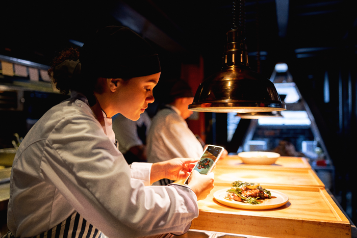
It doesn’t matter how ooey-gooey-delicious your pizza is or that your burgers are the best in the city, good-looking pics are a must. The menu images you use should show off your dishes in all their glory, so it’s best to get a professional photographer to do the job right. On a tight budget? Here are some great tips to help you take stellar menu pics yourself.
- Give it a test drive.
Good-looking images, check. Optimized menu offerings, check. Concise menu descriptions, check. Sounds like you’re ready to roll! Not so fast. Before you get your menu up and running, pass it around to staff, or even a few of your best customers, to gather some feedback. You want to make sure your menu reads well and is as user-friendly as possible before you seal the deal.
The same goes for your online menus. Test the user experience from a customer’s perspective to identify and address any usability or customer experience issues before you go live.
Done and done! We hope these tips will help you elevate your menu mastery to captivate more customers and look good doing it.


